First of all, for the designer who makes the site’s layout, but does not finish the details typical of the web. A peculiar attempt to explain that the website lies beyond the limits of flat printing.
Secondly, for the HTML coder to whom the stateless layout came, so that he could tell designer a few words.
Links
Introduction
<a href="link:;">Link that is a button</a>When you hover over the link that is a button, the javascript:; inscription appears in the lower left corner, or a URL with #: site.com/#
Right click on such button and the context menu will kindly offer:
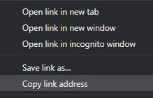
Ctrl+Left click on such button will open a new tab with the exact same page from which we clicked.
In addition, such a link with # will become :visited, if it hasn’t before, and will get the appropriate style. If the designer didn’t kill that behaviour, which in most cases, of course, is in vain. More about that below.
<a href="//link.url">Link</a>- If a click changes the address,
- this address can be copied,
- sent by email
- you can go back to it,
- this is not the address of the page itself
– then it’s a link.
Link must have styles for regular, :active, :visited, :focus и :hover states.
Antipattern
a {
    color: black !important;
    text-decoration: none !important;
    cursor: default !important;
}
Congratulations! With these styles, all your links will visually turn into plain text. Finding them on the page will be extremely difficult.
if you put !important and don’t quite understand why you can’t work without it, perhaps you should change selector a bit, to block off the one that interferes with it.
States
a – regular state
a {
color: #0000ff;
cursor: pointer;
text-decoration: none;
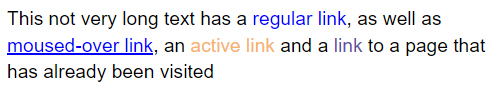
}In the regular state, a must be blue or underlined, preferably blue and underlined, so that the user understands that this is a link without hovering. The user is accustomed to the fact that the blue words on the page are links, even if they are not underlined. If you do not like the blue color for links, change it, but then underline the links.
a:hover
a:hover {
    text-decoration: underline;
}
When the cursor is over the link, it becomes :hover and in this example acquires an underline. So the user will understand that this is, in fact, a link that you can click on.
a:focus
a:focus {
    text-decoration: underline;
}
When a pointer is moved to a link, moved by the TAB ↹ it becomes :focus. Special effects are not necessary, just use the ones :hover has.
CSS to not write twice:
a:focus, a:hover {
    text-decoration: underline;
}
a:active
a:active {
    color: #2e5bce;
}
Important state :active occurs when the user has already clicked on the link, but has not yet released. It helps the user to understand that his click has worked, and he does not need to click on it several times to accurately go to the desired page.
a:visited
a:visited {
    color: #674ea7;
}
:visited helps the user not to forget which pages they have already opened so they won’t have to accidentally open them again. So, together with :active and :hover, we will slightly unload the Internet from random downloads, and make it a little better and faster.
In the HTML4 era, links were used instead of buttons with a dashed line. This pattern is out of date. Dashed underline is recommended for hover tooltips. For example, with <abbr>, such a selection will help understand that you can hover and get more information.
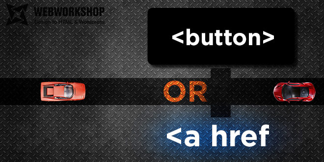
Buttons
- If the click does not change the page address,
- address cannot be copied
- and you can’t share this address
– this is a button.
Availability
<button /> may not be available on old browsers or devices. Buttons will not apply styles without JavaScript. But this should not bother you. On such devices, even JavaScript does not work often. And maybe CSS.
Behavior inside the <form> tag
<button /> by default has the attribute type = submit even if it is not specified. This attribute can also be reset to cancel all that’s been typed in the form and button to exclude influence on the form. Good manners suggest that everywhere you need to write <button type=”button”>Button</button>.
But in fact, you can limit yourself to a full specification only inside <form />,
type = submit inside other tags does not affect anything.
This is a great way to style the submit button. Unlike <input type=”submit” value=”Button” />, inside <button></button> you can write any HTML code, not just text.
For instance:
<button>
  <img src="/images/icon.svg" title="Red pill" alt="icon" />
  <span style="color: red;">Red</span> <span style="color: blue;">Blue</span>
</button>
This gives even more freedom in styling than <input type=”image” />
States
Buttons are similar to links in states, except for buttons do not have a state :visited, but there is a state :disabled.
Usually, the default browser appearance is thoroughly cut out, sometimes with the neutralization of the display of states other than normal.
We would need more styling for this, but it’s not so scary. In addition, the guys from Twitter and partly Google have already taken care of the implementation of ”default” style.
Bootstrap or MaterializeCSS, for example.
Display
This is how <button>Button</button> looks like in Chrome 81:
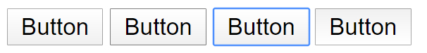
Picture shows button, button:hover, button:focus, button:active states.
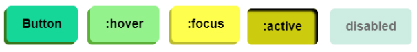
button {
    margin: 1em 0.4em;
    outline: none;
    border: 0;
    background: #15d798;
    border-radius: 7px;
    box-shadow: -4px 4px #38761d;
    padding: 17px 24px;
    text-align: center;
    font: normal bold 1.2rem "Ubuntu", sans-serif;
    transition: all 0.3s ease;
}
button:hover {
    background: #94f28c;
    box-shadow: -4px 4px #5caf38;
}
button:focus {
    background: #fefe4d;
    box-shadow: -4px 4px #bcbc2d;
}
button:active {
    transform: translate(-4px, 4px);
    background: #cccc0e;
    box-shadow: 0px 0px, inset -4px 4px 3px 0 black;
}
button:disabled {
    transform: #cdece2;
    background: 0 0;
    box-shadow: translate(-4px, 4px);
}You may not know CSS, but you must draw all the variants for states of link and buttons.